

This is a post for my Visual Media Class on Typography and Photo Rules.
What is typography?
According to the fourth edition of The Non-Designer’s Design Book by Robin Williams, “Type is the basic building block of any printed page.” This is what we would consider as the style or font we use to type out words on a computer.
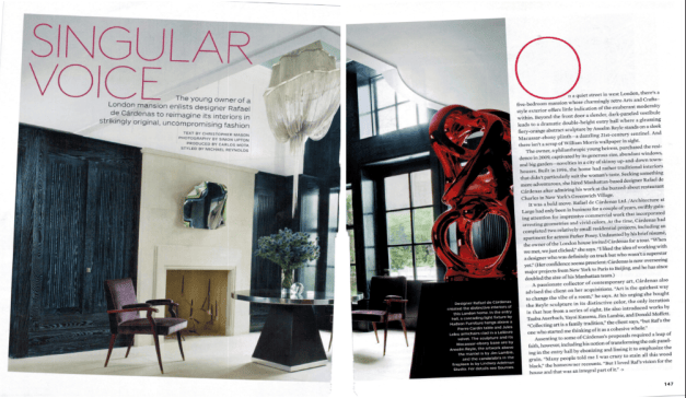
This photo (above) was taken from the Architectural Design Magazine from the May 2013 Edition pages 146-147. The photographer is unknown but the link the picture can be found at is below.
https://archive.org/details/ArchitecturalDigestMay2013/page/n131
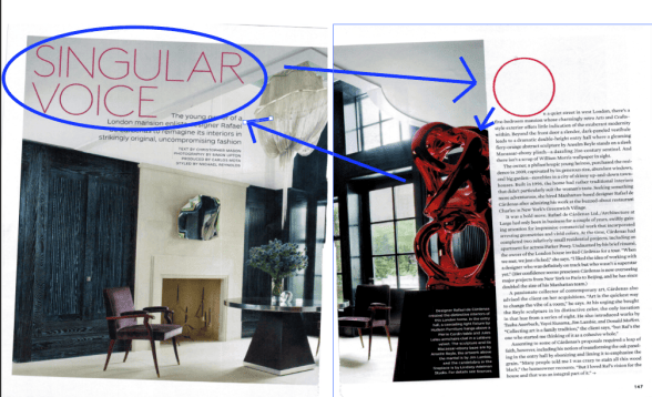
In this picture (above) the words SINGULAR VOICE are typed in a Sans Serif font called Dubai Light.
Sans Serif is a kind of typeface without any bits hanging off the end of any of the letters. Also, ,you would rarely find any changes to the transitions of weight to any of the characters from the start of the stroke to the end. This causes the characters to become very clean and crisp. However, due to the cleanness of the letters, depending on the weight of the font, sans serif can make the letters fade into the background and allow for other things on the page to stand out. In this picture they have added contrast to the page by making the color of the words red and large and tying it over to the very large O used. The pop of red makes it stand out from the plain white and black background while connecting to the picture by using the same red as the art decoration used in the room.
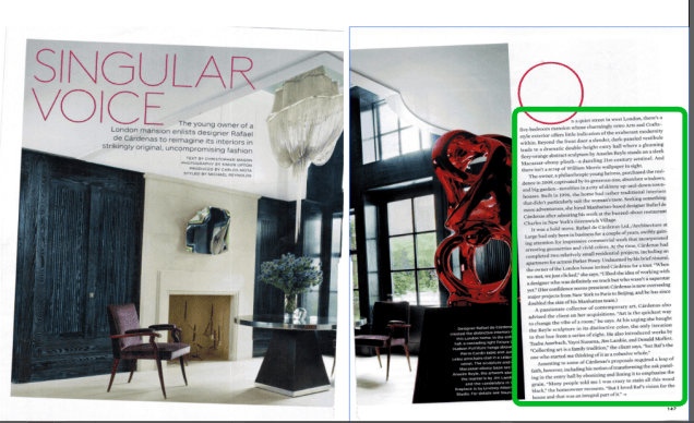
The words used as the main text in the picture (as seen above) are in a typeface from the Old Style typeface. Possibly either Times New Roman or Intellecta Roman. Old style font came to be from the old use of print writing with a calligraphy pen. This type of typeface does include bits hanging on the ends of the letters. The type also includes just like if you were writing with a calligraphy pen weight to the strokes in thin/thick angles in a diagonal pattern as if you were putting more weight in the pen in places on character.
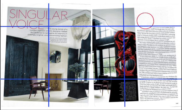
In the picture above you see one of the three rules of photography shown here. The red accent decoration is right on the edge of the rule of thirds. This allows the viewer to see the main focal piece quickly while also using the purple chair to balance the painting.
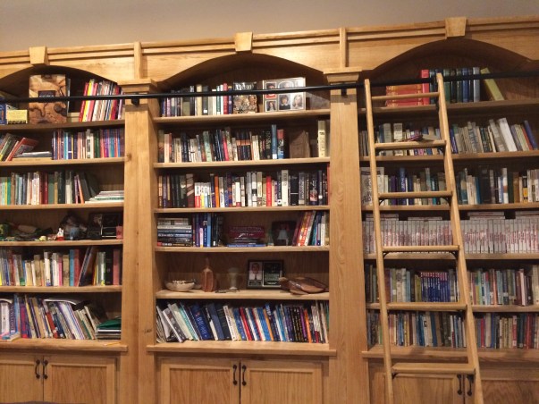
In the picture above the colors are different however the brown ladder is sitting right on the line of thirds drawing the eye to the picture and leading you into the rest of the view. The article of the above first picture was from a architectural design magazine about design. This picture is all about the bookcases, with the ladder as the draw in.

In this picture the bike becomes the focal point. The red pop of color on the line of thirds pulls the eye and the small reddish pot in the corner balances the picture by letting the eyes go back and forth throughout the lines of sight.
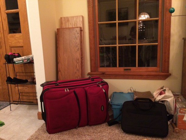
In this final picture, the red suitcase on the line of thirds pulls in the eye and the pink socks in the left top corner make you eyes wander in the picture.
In conclusion, the pops of red in the two picture are similar to the design planned in the article. The red draws the eye and make you want to keep looking the rule of thirds makes the lines of sight more appealing to the viewer and draws the eyes around the picture.
 Airame's Blog for School